There’s a frustrating moment in photography when the exposure looks good, the focus is sharp, and the light is beautiful, but the photograph still feels weaker than you expected.
It’s easy to start questioning your settings, your lens, or the conditions. But sometimes the problem is much simpler: you’ve given too much of the frame to parts of the scene that aren’t helping the photograph.
A small adjustment to those proportions can make a surprisingly big difference. It’s an approach that changed the way I look through the viewfinder, and it doesn’t require memorizing another composition rule.
Composition is subjective. Different framing choices can work beautifully, and a tighter photograph isn’t automatically a better photograph. The goal is to become more intentional about what you include and how much space you give it.
Table of Contents
- Key Takeaways
- Think of Your Frame as Limited Real Estate
- Break the Photograph Into Sections
- A Patagonia Mountain: Keep the Framing, Reduce the Excess
- An Autumn Landscape: When Almost Half the Frame Adds Very Little
- A Grand Tetons Reflection: Apply the Same Idea Vertically
- A Bird Over Norway’s Peaks: Protect the Small Detail That Matters
- Empty Space Isn’t Always Wasted Space
- A Simple Framing Check Before You Press the Shutter
- Sponsor: Squarespace
Key Takeaways
- Divide your frame into sections to see which areas occupy more space than they deserve.
- Tighter framing often strengthens a photograph when it removes excess without sacrificing important context or balance.
- Keep negative space when it supports the subject, atmosphere, or overall balance of the image.
Think of Your Frame as Limited Real Estate
Your photograph is a canvas with a fixed amount of room. Everything you include takes up some of that room.
Imagine a simple landscape: sky at the top, a mountain in the middle, water below, and trees on either side. All those elements might belong in the photograph. But that doesn’t mean they deserve equal space, or that including more of each one makes the image stronger.
The question isn’t just, “Do I want trees in this photograph?” It’s, “Do I need this much of the trees?”
The same goes for the sky, the foreground, and everything along the edges. A supporting element can be useful in a small amount and repetitive in a large amount.
A principle I learned years ago has stayed with me: give the things you love most the space and attention they deserve. That means recognizing what attracted you to the scene, then checking whether the rest of your framing supports it.
Break the Photograph Into Sections
One of the easiest ways to evaluate your framing is to mentally divide the image into sections. I often use quarters.
For a horizontal photograph, imagine four vertical strips, each occupying 25% of the image. For a vertical photograph, try four horizontal strips stacked from top to bottom.
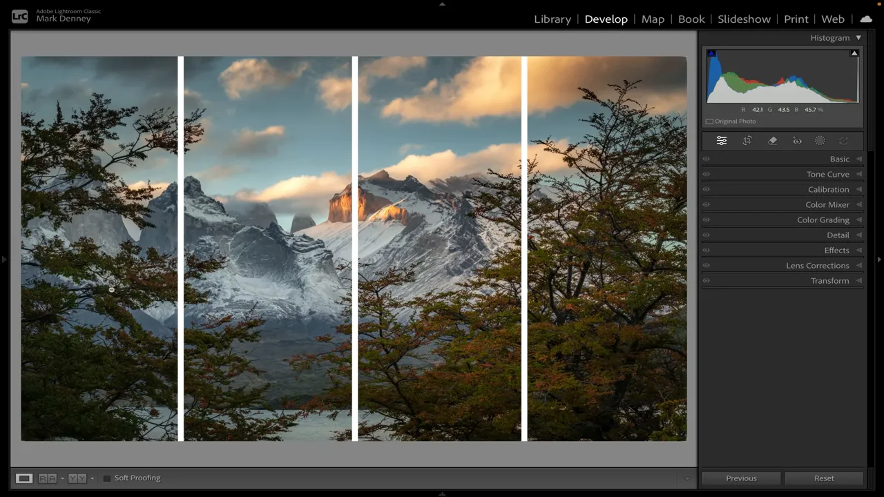
Then evaluate each section separately:
- What is this area contributing?
- Does it contain the main subject or something that supports it?
- Is it adding useful balance, atmosphere, color, or texture?
- Would the photograph lose anything important if I included less of it?
This isn’t about hitting perfect percentages. You can use thirds, halves, or whatever division helps you see the photograph more clearly. The sections are simply a way to stop treating the scene as one big beautiful thing and start noticing how its individual parts work together.
A Patagonia Mountain: Keep the Framing, Reduce the Excess
During a fall workshop in Patagonia, I made a quick handheld photograph of a mountain catching beautiful light. There was a lake below it and trees framing both sides, closely matching that simple landscape arrangement.
The moment happened quickly, and I only captured two or three versions. I didn’t have the time I would normally spend refining the composition.
Looking at it afterward, the mountain was clearly the star. The lake, sky, and trees all contributed, but the outermost trees occupied more room than they needed.
Dividing the photograph into quarters made that easier to see. The central area contained the strongest subject matter, while the extreme left and right added relatively little beyond what was already there.
Using the crop tool, I changed the aspect ratio to 4:3 and brought the sides inward. That wasn’t because 4:3 is a better landscape format. It simply helped tighten this particular photograph.
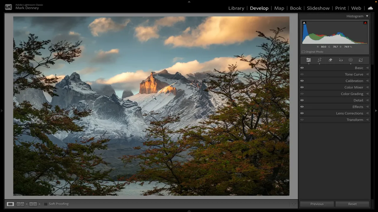
The mountain feels larger, more imposing, and more attention-grabbing. Yet the important relationships remain intact. There are still trees on both sides, water below, and sky above.
That’s the useful distinction: I removed excess coverage, not essential context.
An Autumn Landscape: When Almost Half the Frame Adds Very Little
A more obvious example is an autumn landscape with colorful aspens, a mountain ridge, a broad foreground field, and a large area of blue sky.
This is an easy composition mistake to make. You come across a beautiful place and naturally want to include all of it. But the beauty of the location doesn’t necessarily translate into an equally strong photograph of the entire scene.
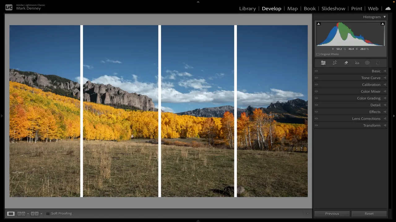
In this photograph, the fall color was interesting. I especially liked a grouping of orange aspens on the right: their color, their trunks, and the way they stood together. Part of the mountain ridge was interesting too.
The field, however, didn’t need nearly as much room. Neither did the mostly plain upper sky. The far left was also less compelling than the area farther right. Altogether, it was fair to say that close to half the frame was contributing very little.
To refine the composition, I made a few specific choices:
- Raise the bottom edge. Keep enough field to establish the foreground without letting it dominate.
- Lower the top edge. Retain the interesting clouds, but remove the unnecessary expanse of blue sky.
- Shift the framing right. Favor the most interesting part of the mountain while preserving the orange aspens.
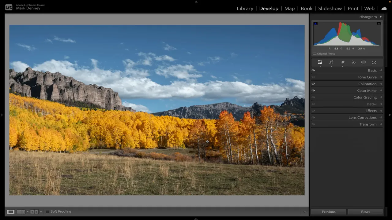
The result is tighter and more focused. It still tells the story of the place, but it gives the strongest elements a greater share of the frame.
Notice that the solution wasn’t to remove the foreground or the sky altogether. It was to include a more useful amount of each.
A Grand Tetons Reflection: Apply the Same Idea Vertically
The same approach works with vertical landscape photography. In a photograph I made in the Grand Tetons, the mountains and their reflection were the interesting parts, with trees on the left helping balance the mountain mass on the right.
But the original composition included a lot more above and below those elements than it needed.
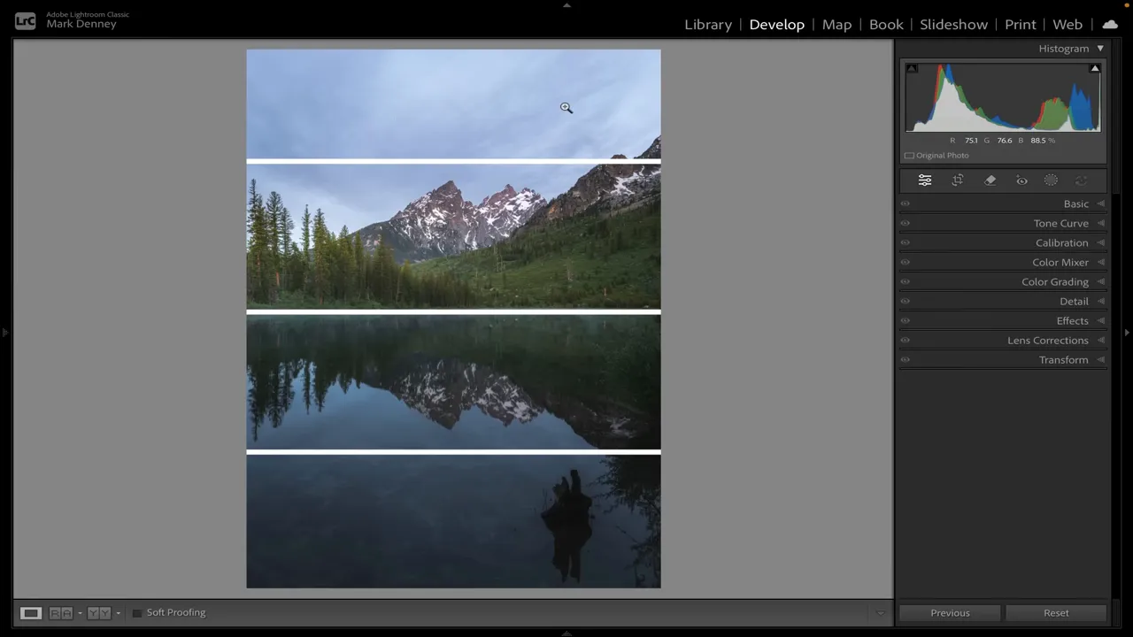
The upper quarter was mostly unremarkable sky, with only a few wispy clouds. The bottom quarter contained scrub and an object protruding from the water, creating an awkward reflection.
Neither area was doing much for the photograph.
I brought the lower edge up to remove the distracting foreground, then lowered the upper edge to reduce the sky. Along the sides, I was careful not to clip the trees I wanted to keep. Those trees mattered because they balanced the mountains.
The revised framing preserved the full mountain reflection, retained a useful amount of sky, and kept that left-to-right balance. Everything felt more proportionate.
Tightening a composition should preserve the relationships that make it work. Removing empty space isn’t helpful if you also cut away the element that provides balance.
A Bird Over Norway’s Peaks: Protect the Small Detail That Matters
Another quick handheld photograph, this time from Norway, shows a bird flying over a beautiful set of snowy peaks.
I loved that small detail. The bird added something important to the mountain scene. But above it was a large area of sky with very little detail or texture, and a distracting area sat along the bottom edge.
In the original framing, roughly a quarter of the photograph was given to an upper area that wasn’t adding much.
The adjustment was straightforward: remove a little from the bottom, bring the top down, and keep the bird comfortably within the composition.
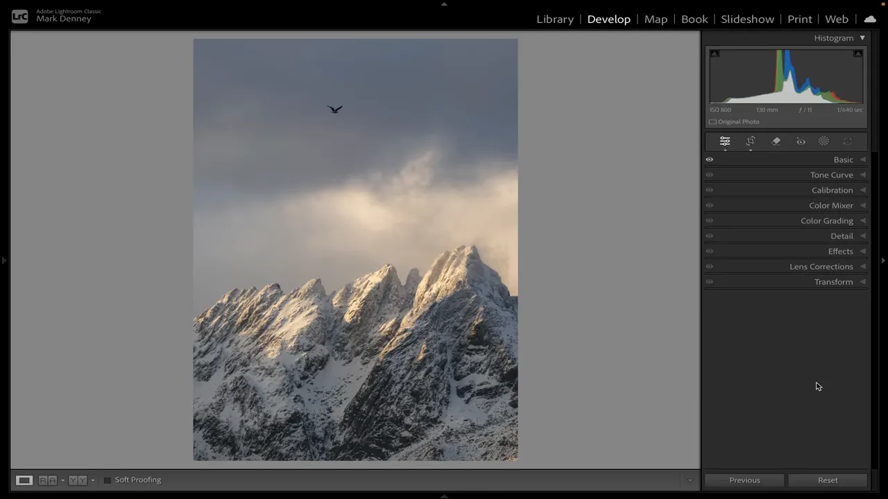
This is a good reminder that “fill the frame” doesn’t mean making the largest object as big as possible. The bird is tiny, but it has value. A successful crop protects it while reducing the space that doesn’t contribute.
Empty Space Isn’t Always Wasted Space
There’s an important exception to all of this: negative space can be beautiful.
A quiet area doesn’t have to contain a distinct subject to serve a purpose. It can provide balance and support the simplicity of the photograph. Adobe’s guide to negative space in photography offers additional context on using the space around a subject intentionally.
In one of my coastal photographs, the main subject matter sits in a relatively narrow band through the center. Perhaps 60% to 70% of the image is sky and dark, largely featureless water.
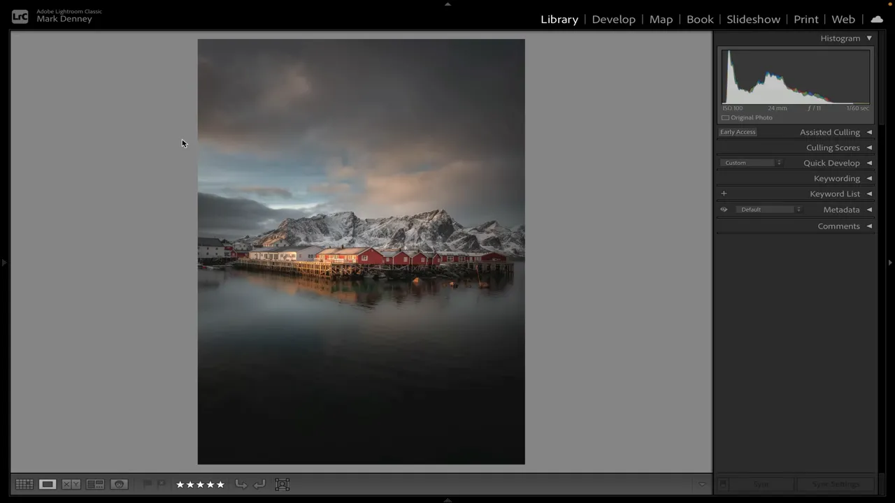
I wouldn’t remove those areas simply because they contain less subject matter. There is interest in the sky, and its visual weight balances the water below. The open areas belong to the composition.
Another example is a minimalist photograph of a mountain peak emerging from mist. There’s very little happening in the lower portion, while the upper portion has some atmospheric texture.
Cropping tightly around the peak makes it much larger, but to my eye, the photograph becomes less successful. It loses the open space that makes the minimalist treatment work. All I wanted to do was clean up a small amount along the bottom, not eliminate the surrounding atmosphere.
In my own photography, I find negative space often works best when the photograph has relatively little going on. That isn’t a rule, either. It’s simply a useful distinction to consider:
- Unnecessary space takes room away from the elements you want to emphasize without giving much back.
- Intentional negative space helps the subject and the overall balance of the photograph.
The question is not whether an area is empty. The question is whether it helps.
A Simple Framing Check Before You Press the Shutter
Although cropping is an easy way to demonstrate these changes, the real value is applying the thinking while you’re on location.
Whenever I look through the viewfinder, I’m asking whether I need that much sky, that much ground, or that much material on either side.
You can turn that into a quick composition check:
- Identify what you love. Be clear about the subject or relationship that made you stop.
- Mentally divide the frame. Use quarters, thirds, or halves to make the space easier to evaluate.
- Inspect the top, bottom, left, and right. Ask whether each area deserves the amount of room it occupies.
- Try a tighter version. Reduce excess while keeping useful context, important details, and balancing elements.
- Check what you lost. If the wider space contributes atmosphere or supports a minimalist composition, keep it.
Over the last ten years, I’ve found that framing a little tighter and removing excess from the edges very often produces a stronger photograph. Not every time, and not in every scene, but often enough that it has become one of my most useful composition habits.
Your frame has limited room. Give that room to what matters, and make the rest earn its place.
Sponsor: Squarespace
I use Squarespace for my website and e-commerce needs. Its Blueprint AI design system, built-in SEO tools, and online store features provide options for showcasing photography and selling physical goods, digital content, or services. If you’re starting a website or upgrading an existing one, the sponsor offer includes a free trial and 10% off your first purchase.


