I used to export a photograph from Lightroom or Photoshop, name it something like “Smoky Mountain Final,” and immediately notice something I wanted to change.
So I would fix it, export it again, and add another number to the filename. Ten exports later, I had some ridiculous version of “Absolute Super Final Smoky Mountain 6.5.” And somehow, I still wasn’t done.
The frustrating part was that I had already spent days working on that photograph. Why did those problems only become obvious after I exported it?
Over the years, three simple checks have helped me get much better at answering a question I hear all the time: How do you know when a photo is actually finished? They help me see the composition more clearly, reassess brightness, and decide whether those final adjustments have gone too far. The first two are useful, but the third has made the biggest difference in my editing.
What You'll Learn
- Rotate your photograph upside down and reduce its size to evaluate compositional balance.
- Switch between light and dark Lightroom backgrounds to reassess perceived brightness.
- Compare virtual copies with opposing adjustments to resolve uncertainty about white balance, exposure, or contrast.
1. Turn the Photo Upside Down to Check the Composition
When you spend enough time working on a photograph, your eyes get used to it. You know where the mountain is, where the foreground rocks are, and where that beautiful autumn tree sits in the frame. Eventually, it becomes difficult to see anything differently.
Turning the image upside down interrupts that familiarity.
I’m talking about rotating it 180 degrees, not mirroring it horizontally. In Lightroom Classic, you can use the rotation controls to turn the photograph upside down temporarily.
What I find is that I stop seeing the scene quite so literally. Instead of concentrating on a mountain, a tree, and some rocks, I begin noticing shapes, proportions, and the balance between different areas of the frame.
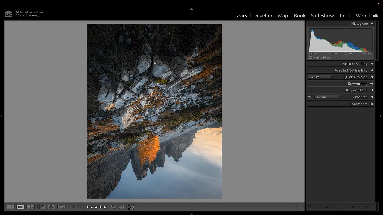
Look for shapes and unnecessary space
One photograph from my fall workshop in the Dolomites is a good example. It has a rocky foreground, mountain peaks, and a bright autumn tree near the center. Upside down, the relationship between the tree and the mountains becomes much more obvious: the two main branches echo the two peaks behind them.
But something else jumps out, too. There appears to be a little too much sky and a little too much dark foreground.
Those areas were easy to accept when I was looking at the scene normally. Once the image was upside down, they felt more like excess space than useful parts of the composition.
Here’s how I worked through it:
- Return the photograph to its normal orientation.
- Open the Crop tool in the Develop module.
- Trim a little from the bottom to reduce the dark foreground.
- Trim a little from the top to reduce the sky.
- Shift the crop slightly sideways to balance the space on either side.
- Turn the photograph upside down again and reassess it.
After that adjustment, the foreground no longer called attention to itself in the same way. The remaining dark space felt more proportionate to the sky.
That doesn’t mean the foreground and sky always need to occupy equal amounts of a photograph. In this particular image, bringing those areas into better balance made the composition feel more resolved.
Make the image smaller, too
You can take this check a step further by reducing the photograph to something close to thumbnail size.
At that size, it becomes harder to get caught up in individual rocks, branches, or textures. The larger shapes stand out much more clearly. Combined with the upside-down view, it’s a useful way to ask:
- Does the composition feel balanced?
- Is there an area of empty space that attracts too much attention?
- Would a slightly tighter crop improve the proportions?
- Does anything immediately jump out that I want to improve?
The goal is to see the same photograph in a less familiar way. You don’t necessarily need another adjustment. You need a better opportunity to notice whether an adjustment is needed at all.
2. Change Lightroom’s Background to Reassess Brightness
The border around your photograph is easy to ignore. But changing it can make a surprising difference to how bright or dark the image appears.
In Lightroom Classic, right-click the background surrounding the photo to choose a different shade. The available choices include white, black, and several grays.
This doesn’t change the photograph’s exposure or any of its editing settings. It changes the context in which you’re judging the image.
If you have spent half an hour editing against a black background, your eyes become accustomed to that presentation. Switch the background to white, and the same photograph can suddenly feel quite different.
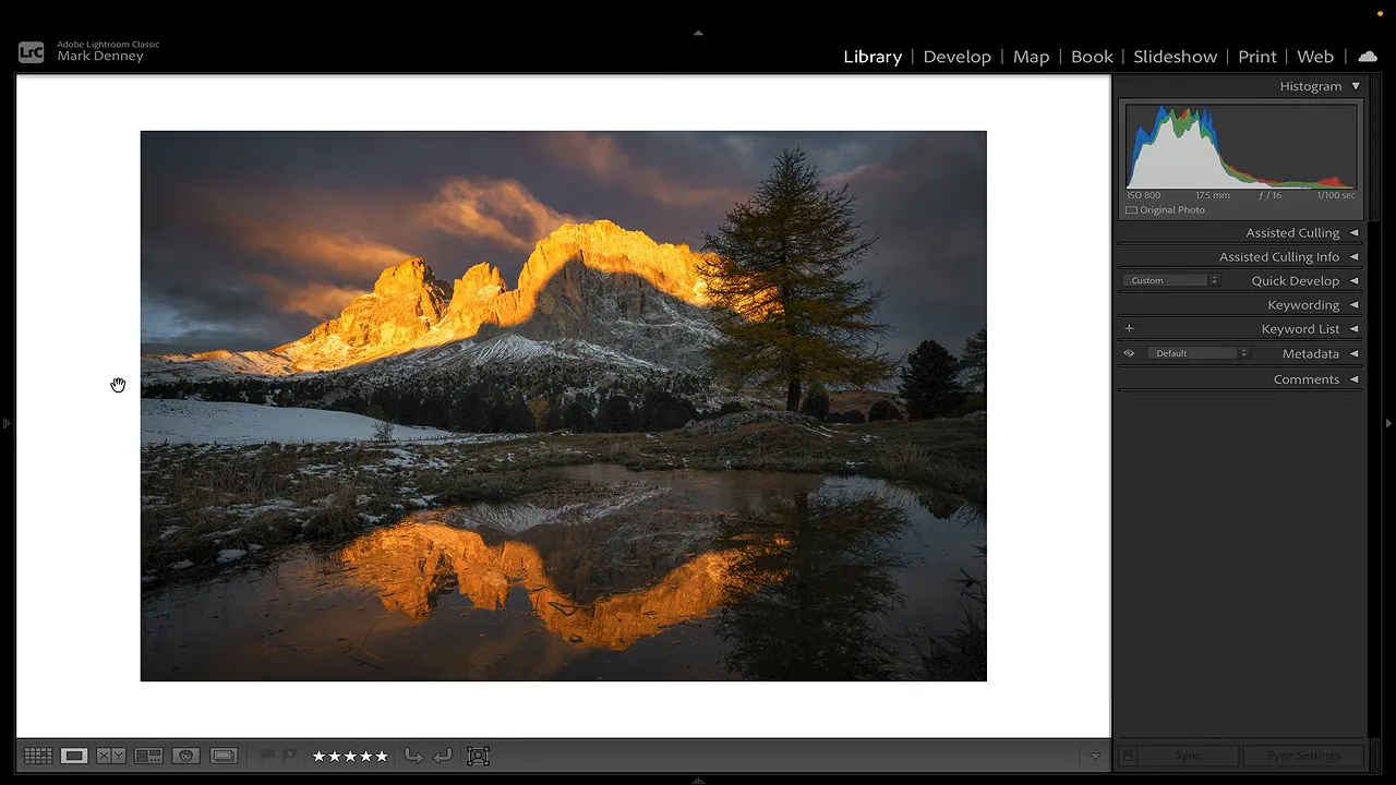
I find that a substantial change works better than a subtle one. Moving from medium gray to a slightly darker gray may not tell you much. Try light gray against dark gray, or go all the way from white to black.
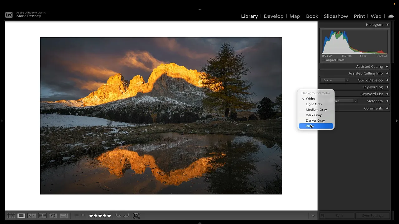
My process is simple:
- Reduce the image size enough to leave a clearly visible border.
- Right-click that border and choose a light background.
- Evaluate the overall brightness of the photograph.
- Switch to a dark background and evaluate it again.
This is a visual check, not a histogram reading. It helps me decide whether the overall brightness still feels right once I stop judging it against the same background I’ve been using throughout the edit.
A different-looking presentation doesn’t automatically mean the exposure is wrong. It’s an opportunity to reassess it before exporting, rather than discovering that uncertainty afterward.
3. Compare Virtual Copies Instead of Guessing at the Final Adjustment
This is the technique that has helped me the most.
Usually, when I’m struggling to finish a photograph, I’m not questioning every decision I’ve made. I’m stuck on one or two things.
For me, those final questions are often:
- Is the photograph too bright or too dark?
- Is the white balance too warm or too cool?
- Have I added too much contrast, or not enough?
Moving a slider back and forth can keep that uncertainty going. Creating alternatives and seeing them together makes the decision much easier.
Create a warmer and cooler version
For this example, I used another Dolomites photograph with fresh snowfall, autumn colors, and light coming into the scene from the right. Snow and fall color together are dream conditions for me, but white balance can be tricky.
It’s tempting to warm up an autumn photograph because it makes the foliage more vibrant. A cooler treatment can also help the warm colors stand out. Which direction actually works better?
Rather than keep guessing, I make two virtual copies of my current edit:
- Keep the base edit. This is the version I’ve already been working on.
- Create the first virtual copy. Right-click the photo and choose Create Virtual Copy. It starts with the existing edits intact.
- Warm up that copy. Move the white balance far enough that the warmer treatment is easy to recognize.
- Return to the base edit. Create another virtual copy from that version, rather than from the warmed copy.
- Cool down the second copy. Now there are three versions: the base edit, a warmer alternative, and a cooler alternative.
Next, I go to the Library module’s Grid view, select all three versions, and press N to open Survey view. That displays the selected photographs together. Adobe’s Lightroom Classic keyboard shortcut reference is useful if you want to keep these navigation shortcuts handy.
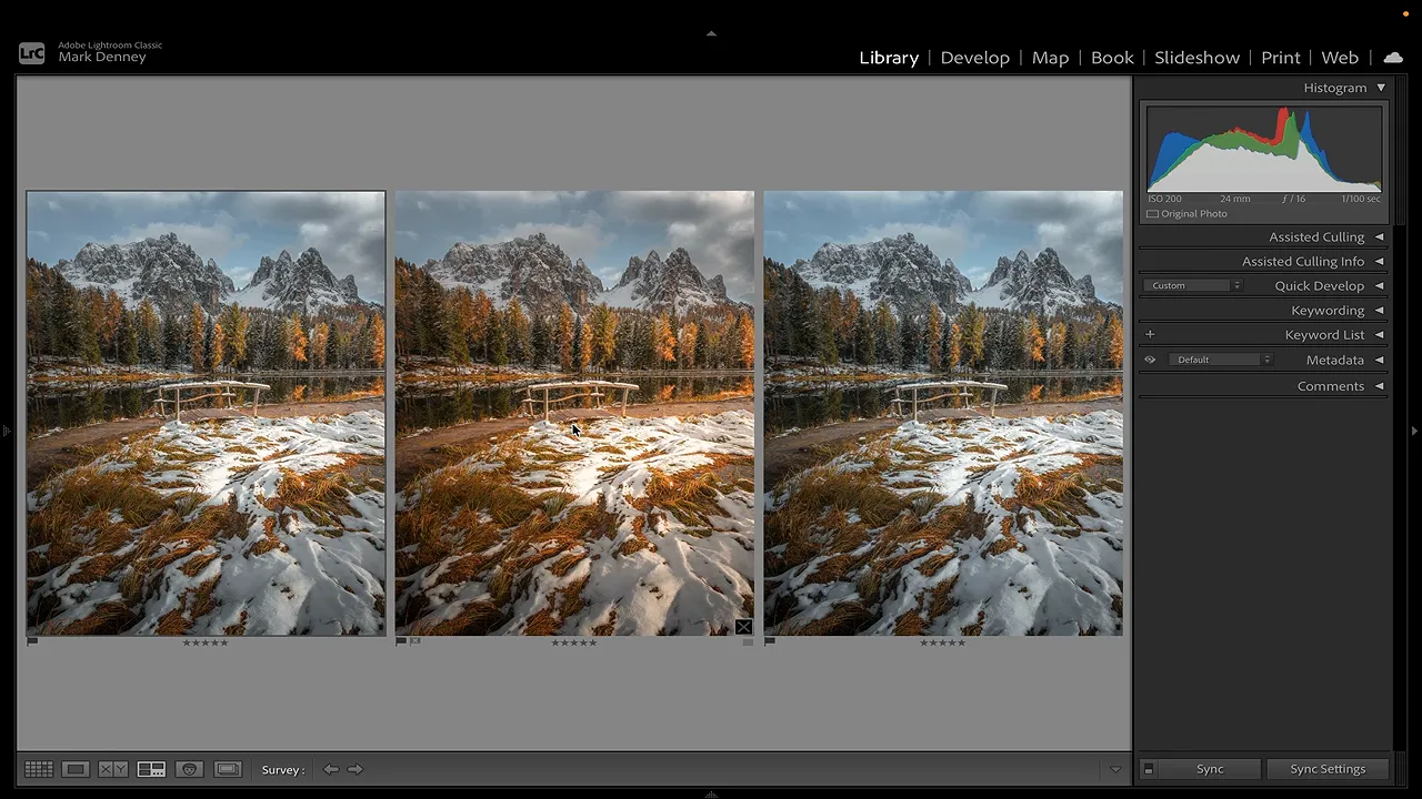
In this comparison, the warmer copy felt too warm, and the cooler copy was definitely too cool. The base edit was closer, but I preferred it with just a little more warmth.
I returned to that base version and brought the temperature to just under 6,000 K. That number was appropriate for this photograph, not a target for autumn photography in general. The useful part was discovering the direction and amount of change through comparison.
You don’t have to choose one of the three versions exactly as it stands. Sometimes the comparison tells you that the best result sits between your base edit and one of the alternatives.
Use the same approach for contrast or exposure
Once I’m done with a comparison, I can remove the virtual copies I no longer need and repeat the process for a different adjustment.
For contrast, I used the same photograph with these three settings:
- Base edit: Contrast at +6.
- Higher-contrast copy: Contrast increased to about +46.
- Lower-contrast copy: Contrast reduced to about -15.
Then I selected the three versions and pressed N again.
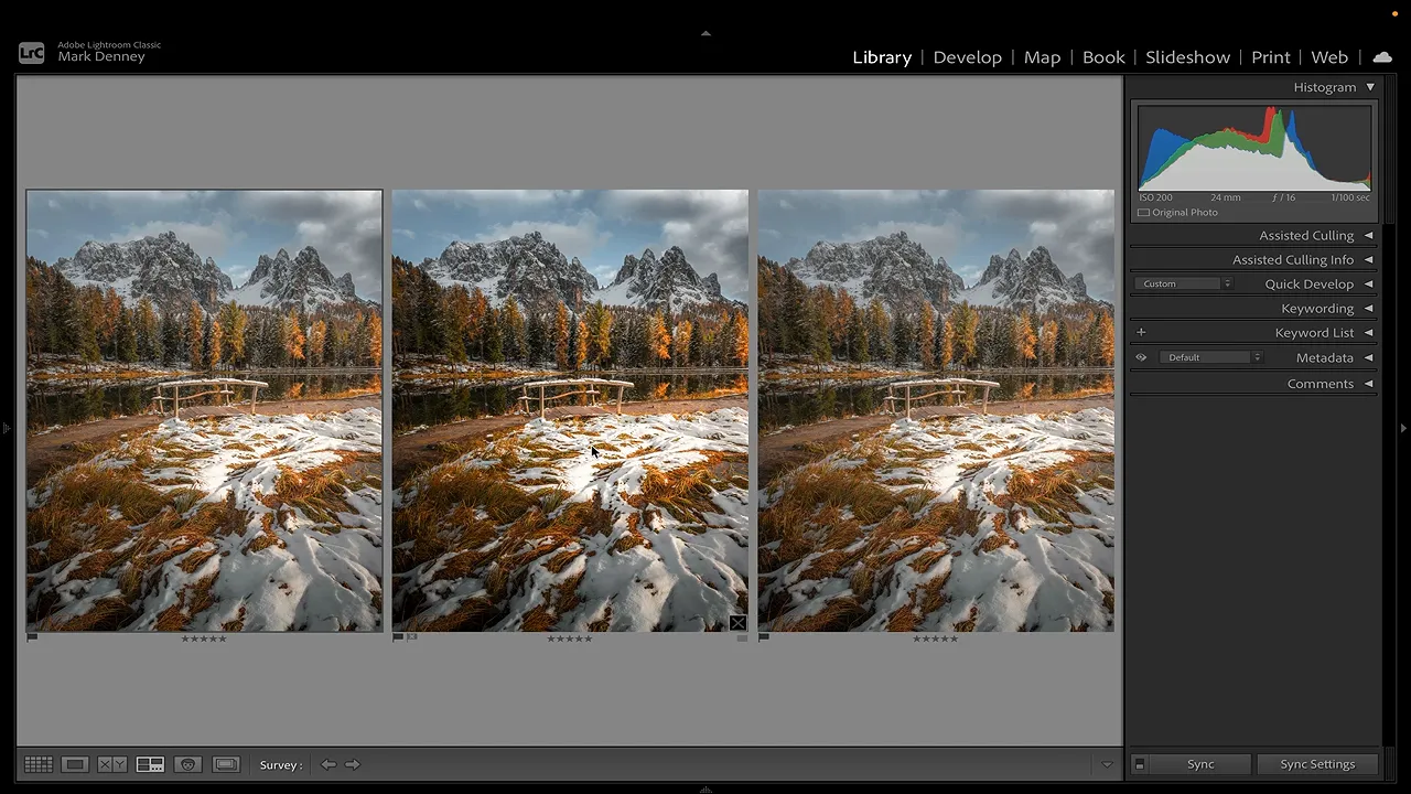
Those values aren’t a recipe. They simply create enough separation to make the differences clear. The comparison helps me decide whether I prefer more contrast, less contrast, or something close to where I started.
The same method works for exposure: keep the base edit, make a brighter version, make a darker version, and compare them together.
Keep the comparison focused on the adjustment you’re uncertain about. If white balance is the question, change white balance. If contrast is the question, change contrast. That way, you can actually identify what you prefer.
Know What You’re Still Trying to Fix
Knowing when to stop editing gets easier when you replace a vague feeling that “something isn’t finished” with a specific question.
Is the crop balanced? Turn the photograph upside down and make it smaller. Does the brightness feel right? Change the surrounding background. Unsure about warmth, exposure, or contrast? Create alternatives and compare them side by side.
These checks have helped me catch things I had stopped noticing and resolve the final decisions that used to keep me exporting the same photograph over and over.
The biggest improvement has come from comparing actual options instead of trying to imagine them. When I can clearly see what more and less look like, it becomes much easier to decide what the photograph needs, make that final adjustment, and call it finished.


