Every fall, I come home with photographs of colors that looked incredible on location. Then I open them in Lightroom and have the same reaction: the photo looks good, but it doesn’t quite have the feeling I remember.
The easy response is to increase saturation. Maybe push vibrance a little further, too. And yes, the photograph becomes more colorful. But more colorful doesn’t necessarily mean better. Sometimes it looks substantially worse.
Fall photographs can contain more color variety in a single frame than almost anything else we photograph throughout the year. Rather than making every color stronger, I like to work on color brightness, color relationships, and the way Lightroom renders the primary colors.
Three tools do most of that work: Luminance, Hue, and Calibration. Here’s how I use them to bring an autumn landscape to life without relying on the global Saturation or Vibrance sliders.
Key Takeaways
- Use luminance to emphasize sunlit foliage and create separation between the colors in your photograph.
- Small hue shifts and selective desaturation can simplify a busy fall color palette.
- Calibration changes primary-color rendering across the image, offering a different approach to richer color.
- Compare the full edit with your starting point and reduce individual saturation where colors feel too strong.
1. Use Luminance to Bring Out the Light in Your Colors
The first adjustment is inside Lightroom’s Color Mixer, but it isn’t in the Saturation section. Open Luminance instead.
Luminance is simply the brightness of a color. Increasing yellow luminance brightens the yellow areas of the photograph. Decreasing it makes those same areas darker.
That might sound like a small distinction, but it can make a tremendous difference to fall foliage, especially when sunlight is coming through the leaves.
Brighten the color that matters most
In the forest photograph I’m working with, yellow is the star of the show. The sun is rising through the trees, and the light is coming through the canopy. I want the edit to emphasize that existing light.
Increasing yellow luminance helps the leaves feel more luminous. They stand out because they look brighter, not because I’ve made their color more intense.
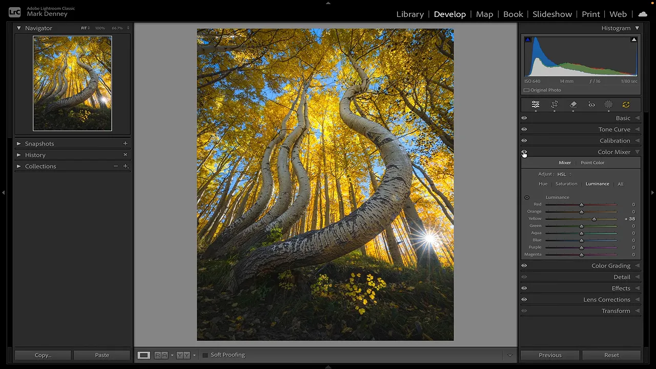
When you’re learning what a slider affects, move it back and forth through a wider range. That makes the affected areas easier to identify. Then settle on a more restrained adjustment and toggle the panel off and on to judge the result.
Create separation instead of brightening everything
It’s tempting to increase the luminance of every color once you see how effective this can be. But if every color demands equal attention, you lose the distinction between them.
A better approach is to brighten some colors and darken others. This creates color separation, which can help the photograph feel a little more three-dimensional.
For this image, I make three decisions:
- Increase yellow luminance to bring out the bright canopy.
- Decrease orange luminance slightly to give the smaller orange areas some separation from the yellows.
- Increase green luminance a little to emphasize a small patch of leaves already catching sunlight.
The point isn’t that yellow should always get brighter or orange should always get darker. Those choices serve this particular photograph. Look at your own image and decide which colors should lead and which should support them.
Simplify competing colors with selective desaturation
While I’m in the Color Mixer, I also visit the Saturation controls. But instead of adding saturation, I remove a little from the greens and from the blue sky.
This is an important part of the process. Fall scenes commonly have three, four, or even five colors competing in the same frame. That variety can make a photograph feel busy, even when the composition itself is fairly simple.
Reducing blue saturation makes the sky less distracting. Taking some intensity out of the greens helps those areas sit more comfortably with the dominant yellow foliage.
Sometimes the best way to make your main color stand out is to quiet another color down. At this stage, the image already feels quite different, and I haven’t increased saturation anywhere.
2. Adjust Hue to Make the Color Palette More Cohesive
The second tool is also in the Color Mixer: Hue.
Where luminance controls brightness, hue changes the color itself. With yellow, for example, you can shift it toward orange or toward green.
Understanding how Lightroom arranges the color channels makes these controls much easier to use. The order isn’t random. It follows the progression around the color wheel.
- Yellow: Moving left shifts it toward orange; moving right shifts it toward green.
- Orange: Moving left shifts it toward red; moving right shifts it toward yellow.
- Green: Moving left shifts it toward yellow; moving right shifts it toward aqua.
In the vertical Color Mixer layout, moving left generally shifts a channel toward the neighboring color above it, while moving right shifts it toward the neighboring color below it. Once that clicked for me, the Hue controls made a lot more sense.
Keep the foliage believable
The leaves in this photograph were yellow in person. I don’t want to turn them orange just because an orange canopy might look dramatic.
Instead, I make a small adjustment to the yellows so they feel a little more clearly yellow rather than greenish. Then I shift the oranges slightly toward yellow and bring the small green area closer to yellow as well.
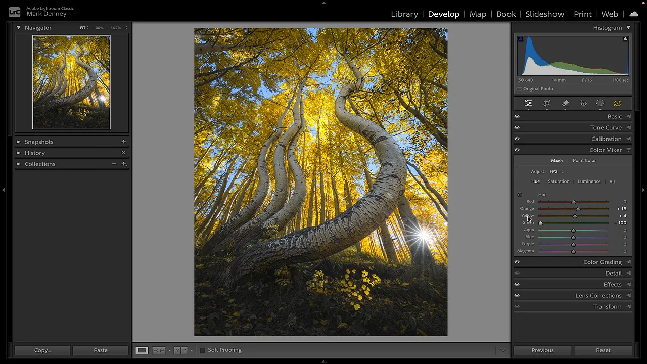
These are subtle changes. I’m not trying to turn every leaf into the same color. I’m bringing the supporting colors into a more cohesive relationship with the dominant foliage.
Toggle the Color Mixer off and on again. Between luminance, selective desaturation, and those small hue shifts, the scene should feel more intentional. The sunlight has more presence, and the colors compete less with one another.
For a reference on where these controls fit within the editing workspace, Adobe’s Lightroom Classic Develop module guide is useful to keep handy.
3. Use Calibration for Richer Color
The third tool is my favorite, and it’s the one that often does the most heavy lifting: the Calibration panel.
Calibration can be confusing because its controls don’t behave the way their labels might initially suggest. You see Red Primary, Green Primary, and Blue Primary, each with Hue and Saturation sliders. It’s natural to assume Blue Primary Saturation will affect only the blue objects in the photograph.
But move that slider, and the yellow leaves change too. Move Red Primary Saturation in an image with very little obvious red, and you can still see changes throughout the scene.
Primary colors are not the same as Color Mixer ranges
The useful distinction is that an RGB photograph represents color through combinations of red, green, and blue components. Calibration works with those underlying primaries rather than simply targeting the visible blue, green, or red areas as separate color ranges.
That’s why Blue Primary can influence yellow foliage. It isn’t restricted to the blue sky.
You don’t have to understand every technical detail to begin experimenting, but you do need to recognize that Calibration adjustments can influence colors across the image. Judge the whole photograph, not just the color named beside the slider.
Start with primary saturation
I usually begin with Blue Primary Saturation. For this photograph, my initial adjustments are approximately:
- Blue Primary Saturation: Increase into the mid-30s.
- Green Primary Saturation: Increase into the upper 20s.
- Red Primary Saturation: Increase into the upper 20s.
Those are starting values for this edit, not a formula to apply to every fall photograph. Move each control back and forth, identify what it changes, and choose the amount that works for your image.
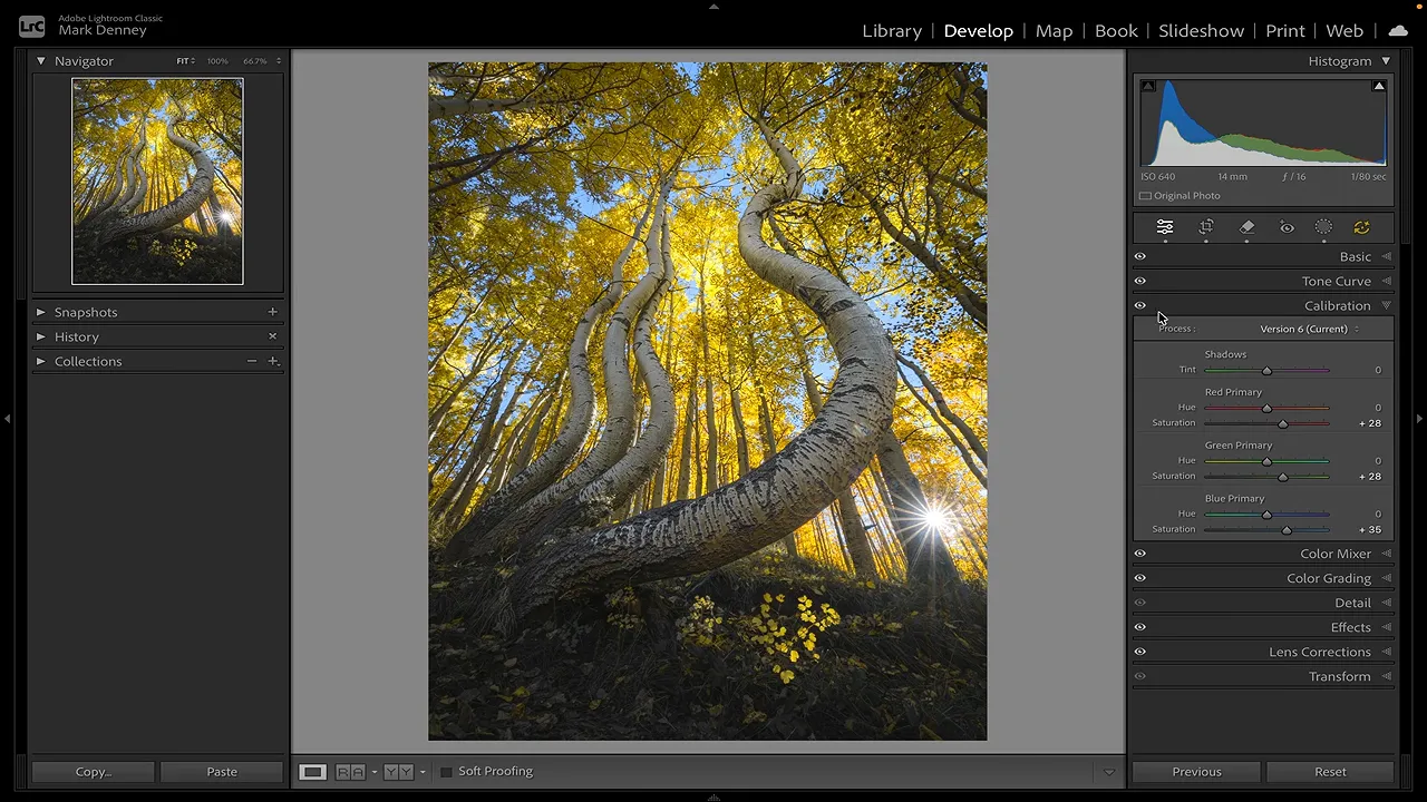
When I toggle Calibration off and on, the colors gain a richness that I much prefer to the result of simply raising global saturation. Combined with the luminance and hue work, the photograph starts to come together.
To be clear, we are increasing sliders labeled Saturation inside Calibration. What we’re avoiding is the global Saturation and Vibrance approach, which doesn’t give us these separate primary-color adjustments.
Refine the primary hues carefully
Each primary also has a Hue control. These deserve the same careful experimentation.
In this photograph, changing Blue Primary Hue pushes the foliage toward colors I don’t want. One direction makes the yellows more orange, while the other moves the image even further from the look I’m after. I leave that control alone.
Green Primary Hue is more useful here. Moving it left makes the yellows stand out more, while moving right gives a more subdued result. I settle on a modest move left.
Then I move Red Primary Hue slightly right, which brings the foliage a little closer to the yellow I want.
These observations belong to this image. The important habit is to test each control, look across the whole frame, and keep only the changes that support the photograph. There’s no requirement to adjust every slider.
Finish by Pulling Back Anything That Feels Too Strong
After working through all three tools, compare the complete color edit with the starting point. Then ask a different question: not “Is it more colorful?” but “Does it look better, and does it still feel believable?”
In my initial edit, the yellows end up a little stronger than I would normally leave them. So I return to the Color Mixer’s Saturation section and reduce yellow saturation slightly.
That isn’t undoing the work. It’s refining it. I can keep the brighter canopy, the color separation, and the richer rendering from Calibration while bringing the strongest color back under control.
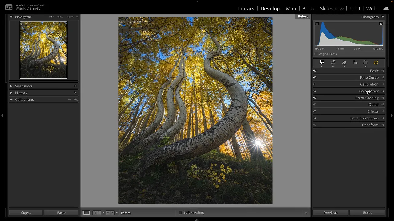
Pay attention to the smaller details as you compare. In this image, I particularly like the little patch of leaves catching light near the lower part of the scene. The adjustments make that existing light feel more present without needing to make every color equally intense.
I used to think richer color simply meant more saturated color. After using Calibration for years, I don’t see it that way anymore. To my eye, richness also comes from depth, separation, and the relationships between colors.
The next time your fall photos don’t quite match the feeling you remember, leave the global sliders alone for a moment. Brighten the colors that carry the light, refine the hues that compete, and explore Calibration. You may find that the photograph needs better color relationships far more than it needs more saturation.
Get More Comfortable With Calibration
If Calibration still feels a little mysterious, I put together a free course that takes a deeper look at how it works. It runs a little under 30 minutes and explains not just what the controls change, but why they affect your photographs the way they do.
|