If you open a photo in Lightroom and it looks too dark, increasing Exposure feels like the obvious place to start. And that makes sense. Brightness is something we consider in just about every photograph we edit.
But as you move that slider to the right, some areas can start looking washed out while others still don’t look quite right. The photograph is brighter, but it isn’t necessarily better.
The problem is that Exposure makes a broad adjustment. It doesn’t know which tones need help and which ones already look good. For my landscape photography, I usually prefer three more targeted adjustments: setting the white and black points, lifting midtone luminance in Color Grading, and adding a very subtle S curve.
That second technique does most of the heavy lifting. It’s one of my favorite ways to improve brightness without relying on the Exposure slider at all.
What You'll Learn
- Set white and black points before deciding whether the photograph needs a broad Exposure adjustment.
- Use Color Grading’s Midtones Luminance slider to target brightness in the middle tonal range.
- Apply a subtle S curve to add midtone contrast without making the photograph feel darker.
Why a Brighter Photo Isn’t Always a Better Photo
For this example, I’m using a photograph from a workshop in the Dolomites in Italy. It’s a mountain scene filled with clouds, mist, dark rock, and a warm foreground ridge. I absolutely love this photograph, and preserving that atmosphere matters much more to me than simply making everything lighter.
To create a comparison, I first made an edit that relied mainly on Exposure. I raised it while keeping an eye on the histogram, then increased Whites and lowered Blacks to give the photograph a more finished tonal range.
That version was definitely brighter. But it also demonstrated why I don’t usually want Exposure doing most of the work.
As you raise Exposure, the histogram shifts broadly toward the right. That can be useful when the whole image needs a lift. But when only certain tonal ranges need attention, it’s a fairly blunt instrument.
The better question isn’t simply, “Does this photo need to be brighter?” It’s, “Which tones need to be brighter?”
1. Start With the White and Black Points
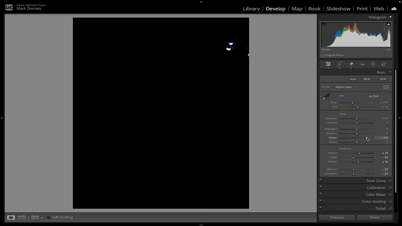
The first slider I touch in the Basic panel’s Tone section is usually Whites, not Exposure.
Increasing Whites primarily affects the brightest end of the tonal range. You can see that difference in the histogram: the right side responds much more directly, rather than the entire distribution moving as broadly as it does with Exposure.
I think of Whites as a scalpel compared with the much broader cut of Exposure. It gives me a more precise place to begin.
Set the Whites Without Pushing Too Far
There are two useful ways to find a starting point:
- Hold Shift and double-click the Whites label. Lightroom makes an automatic adjustment for that slider.
- Hold Option while dragging Whites. This displays a clipping preview. Increase the slider until the first bright pixels appear, then back it off slightly. On Windows, use Alt.
I prefer to leave a little breathing room rather than push the white point too aggressively. The goal is to establish brightness, not sacrifice detail in the brightest parts of the photograph.
Balance the Blacks, Then Refine Highlights and Shadows
Next, I adjust Blacks. Moving this slider to the right lifts the darkest tones and can help the image feel brighter without treating every tonal range the same way.
In this Dolomites photograph, I raise Blacks a little. That doesn’t mean every image needs the same treatment. I’m looking for a dark-tone balance that suits this particular scene.
Once the white and black points are in place, I make small adjustments to Highlights and Shadows as needed. Those controls help refine the lighter and darker areas between the tonal extremes.
Already, the photograph looks better balanced, and Exposure is still untouched. This first stage establishes the tonal foundation. The next adjustment is where the image really begins to come together.
2. Brighten Midtones With Color Grading Luminance
Lightroom’s Basic panel has sliders for Highlights, Shadows, Whites, and Blacks, but there’s no dedicated Midtones slider sitting alongside them.
There is, however, a very useful workaround in Color Grading.
That panel lets you work with Shadows, Midtones, and Highlights separately. And although its name suggests color adjustments, it also includes a Luminance control for each range. Luminance controls brightness, which is exactly what we need here.
- Open the Color Grading panel.
- Select the individual Midtones view.
- Locate the Luminance slider beneath the color wheel.
- Move Luminance to the right to brighten the midtones.
- Toggle the adjustment off and on, then refine the amount.
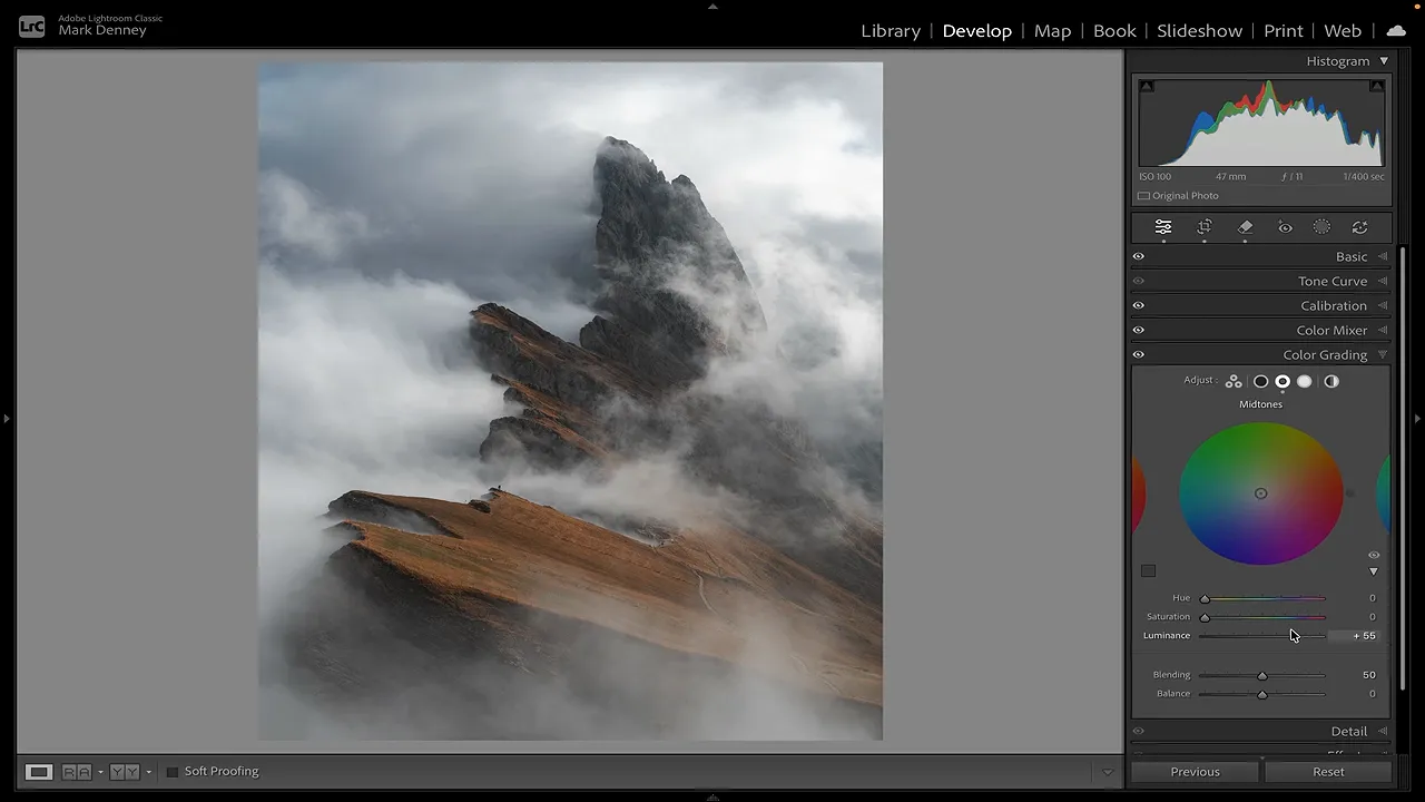
The midtones occupy the central portion of the histogram, and in many photographs they account for a substantial amount of the image. Being able to lift that range gives you a tremendous amount of control over perceived brightness.
As I increase Midtones Luminance in this photograph, the central tonal values move brighter. The image opens up without the same broad shift I get from Exposure.
I initially push the adjustment far enough to make its effect obvious, then dial it back. That’s a useful habit: establish what the control is doing, then settle on an amount that actually suits the photograph.
You don’t need to add a color tint to use this technique. We’re using the luminance slider, not moving the color wheel toward a hue.
This is an adjustment I use on almost every photograph. For this workflow, it’s the most important of the three because it addresses so much of the brightness that needs attention.
For more detail on the individual controls, Adobe’s Lightroom Classic tone and color reference is a useful companion.
3. Add a Subtle Midtone S Curve
Once the brightness is in a good place, I move to the Tone Curve to refine contrast.
I know the Tone Curve can feel intimidating, but this adjustment is very simple. We’re making two small changes: lifting the brighter midtones and lowering the darker midtones.
Just as with the histogram, darker tones sit toward the left of the curve and brighter tones toward the right. The central area represents the midtones.
- Add a point in the brighter midtones, to the right of center, and lift it slightly.
- Add a point in the darker midtones, to the left of center, and lower it slightly.
- Toggle the curve off and on to check that it adds separation without becoming heavy-handed.
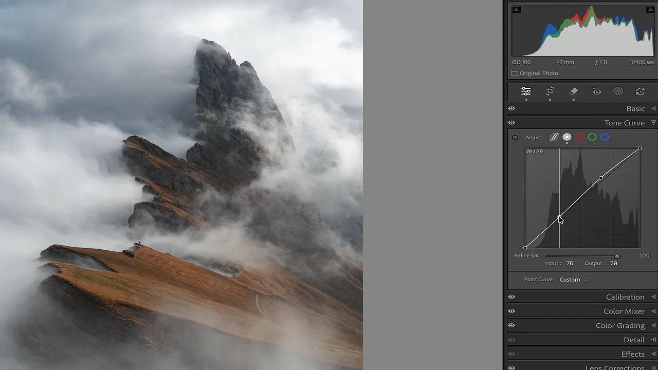
That creates the gentle S curve you’ve probably heard about. The important word is gentle. These are small movements, not a dramatic reshaping of the curve.
Have you ever added contrast and felt as though the entire photograph became darker? Working with these two midtone regions gives you more control over that balance.
In this example, the brighter midtones become a little brighter while the darker midtones become a little darker. The separation between them adds contrast without making the whole photograph feel darker.
That’s exactly what I want: more definition while keeping the brightness we just worked to establish.
Compare the Two Edits Side by Side
The difference becomes much clearer when the two versions sit next to each other.
On the left is the edit that relied mainly on Exposure, with supporting Whites and Blacks adjustments. On the right is the version built with white and black points, Midtones Luminance, and a subtle Tone Curve, plus small Highlights and Shadows refinements.
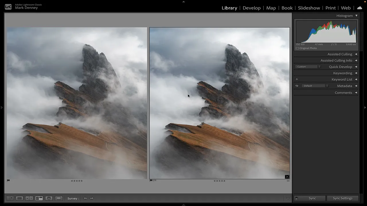
To my eye, the Exposure-led version looks more washed out. The darker tones have less depth, and the brighter tones don’t have quite the same balance.
The targeted edit preserves stronger separation between the rock, mist, and foreground while still making the image brighter. And if a shadow area needs a little more lift, I can simply return to Shadows and make a small adjustment there.
That’s the real benefit of this approach. I’m not asking one slider to solve several different tonal problems.
When I Still Use the Exposure Slider
I very rarely use Exposure as my primary brightness adjustment, but that doesn’t mean it never has a place.
If a photograph is severely underexposed, I may work through these three techniques and still find that it needs a broader lift. In that situation, I’ll add a little Exposure to finish balancing the image.
The distinction is that it becomes a supporting adjustment rather than the automatic first move.
For your next landscape edit, try this order:
- Set the white and black points, then refine Highlights and Shadows.
- Lift Midtones Luminance in Color Grading.
- Add a subtle S curve to separate brighter and darker midtones.
- Reassess the photograph before deciding whether Exposure is needed.
The goal isn’t to avoid a slider just for the sake of avoiding it. It’s to brighten the tones that need help while preserving the parts of the photograph that already look right. Over the years, that change in approach has made a substantial difference in my landscape edits.


