There is a colossal amount of information out there about photo editing. Tips, tricks, techniques, and enough sliders to make you wonder whether you need to touch every single one.
But the basics are where most of the heavy lifting happens. Once you have a solid foundation, the rest is largely about polishing the smaller details.
That is why I use a repeatable Lightroom workflow. It gives me a starting point, keeps me organized, and helps me avoid overlooking something important. The process stays consistent, even though the adjustments change from one photograph to the next.
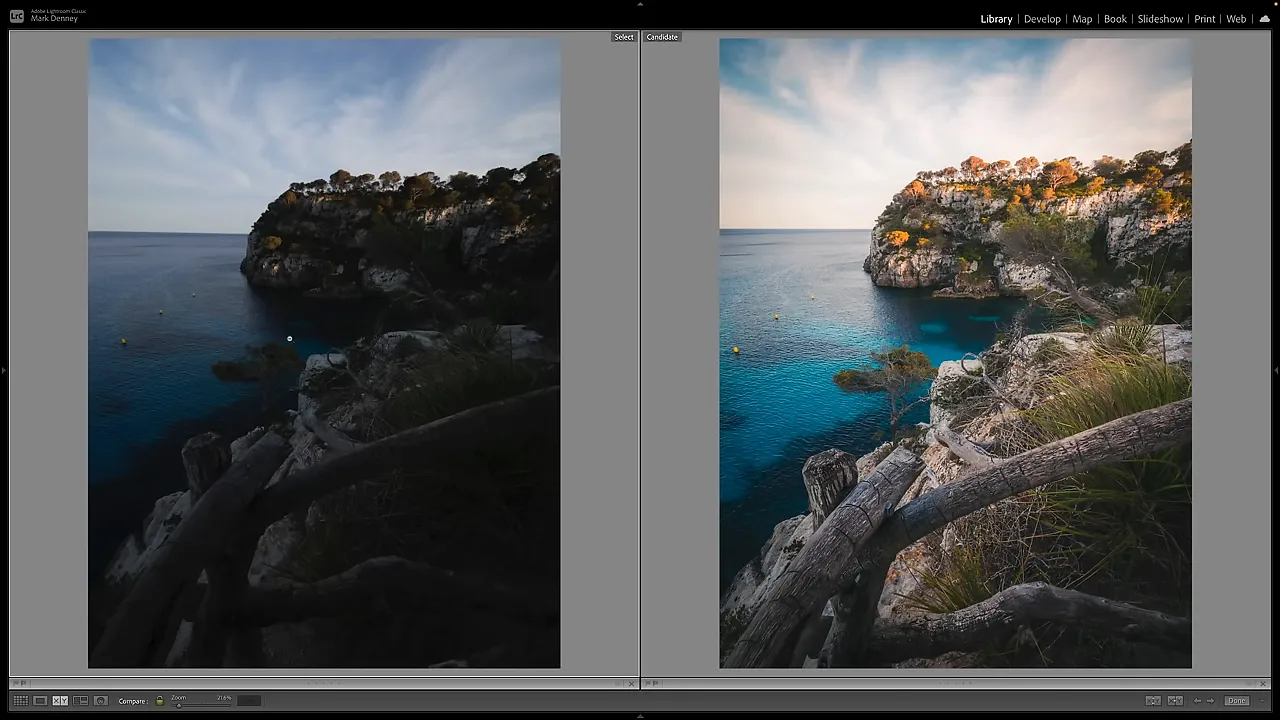
For this example, I’m working with a RAW landscape photograph from Menorca, Spain. It starts quite dark, with a beautiful wooden fence in the foreground, turquoise water, and warm light across the distant cliffs. The goal is to bring those qualities forward without losing what drew me to the scene.
Key Takeaways
- Arrange Lightroom’s Develop panels to follow a consistent editing sequence and reduce missed steps.
- Balance exposure before judging white balance, then refine composition, contrast, and color.
- Use local masks after global adjustments to enhance light and emphasize important details.
- Finish by revisiting the overall balance and removing small distractions without erasing useful compositional elements.
Table of Contents
- 1. Organize Lightroom Around Your Editing Workflow
- 2. Balance the Exposure in the Basic Panel
- 3. Adjust White Balance After Exposure
- 4. Crop and Straighten the Composition
- 5. Add Contrast With the Tone Curve
- 6. Refine Color From Broad Adjustments to Specific Ones
- 7. Sharpen, Add a Subtle Vignette, and Check Corrections
- 8. Use Local Masks to Guide Attention
- 9. Revisit the Basics and Clean Up Distractions
- A Consistent Process, Not Identical Settings
- Sponsor Note
1. Organize Lightroom Around Your Editing Workflow
Before making any adjustments, I like to organize Lightroom Classic’s Develop panels in the order I actually use them.
Right-click a panel heading and choose Customize Develop Panel. You can then rearrange the panels to suit your own process. My preferred order is:
- Basic
- Tone Curve
- Calibration
- Color Grading
- HSL/Color
- Detail
- Effects
- Lens Corrections
- Transform
This keeps my color tools together and places the sections I use less often near the bottom. Save the arrangement and restart Lightroom when prompted.
The particular order is personal preference. The important part is that the interface becomes a reminder of your process. I can start at the top and work downward rather than jumping between panels and trying to remember what I have already done.
A workflow is a checklist, not a requirement to move every slider. Some photographs need a particular tool, and others do not.
2. Balance the Exposure in the Basic Panel
My first editing task is to get the overall exposure into a useful place. This RAW file is clearly underexposed, particularly around the fence and foreground rocks.
I work through the tonal controls with that imbalance in mind:
- Exposure: Raise the overall brightness to establish a better starting point.
- Highlights: Bring these down to control the brighter areas.
- Shadows: Lift these to reveal detail in the darker foreground.
- Whites: Increase the white point to give the image a little more brightness and life.
- Blacks: Lower the black point slightly to retain depth.
I’m not trying to finish the photograph here. I’m trying to balance it well enough that I can make sensible decisions about color, contrast, and local adjustments.
Soften the overall feel while retaining texture
There is a combination I use on many of my landscape photographs: negative Clarity, positive Texture, and a little negative Dehaze.
I often bring Clarity down to around -20, increase Texture slightly, and reduce Dehaze a small amount. For my taste, that softens the overall rendering while keeping some of the finer surface detail.
These are stylistic choices, not settings that every image needs. The useful lesson is to judge the combination rather than assuming every detail-related slider should move in the same direction.
3. Adjust White Balance After Exposure
I prefer to set white balance after balancing the exposure. Once I can see the photograph more clearly, it is easier to judge whether the color feels right.
Start with the White Balance Selector and click something that should be reasonably neutral. In this scene, I use a light, fairly neutral area to make a small correction.
Then I use a quick diagnostic:
- Temporarily increase Saturation to +100.
- Look for an unrealistic color cast that may have resulted from the white balance adjustment.
- Return Saturation to 0 after checking.
The exaggerated saturation makes unwanted casts easier to notice. It is just a checking tool, not the intended appearance of the finished photograph.
For more detail on these controls, Adobe’s guide to adjusting image color and tone is a useful reference.
4. Crop and Straighten the Composition
Once exposure and white balance are in place, I make my initial crop. Almost every photograph I capture gets cropped in some way, so I like to address the composition before spending much time refining it.
The wooden fence is what drew me to this scene. I want the crop to support that foreground subject, so I trim away an awkward section at the bottom, refine the top edge, and straighten the slightly crooked horizon.
I also shift the crop sideways to preserve a small yellow buoy in the water. That little detail matters to the overall balance.
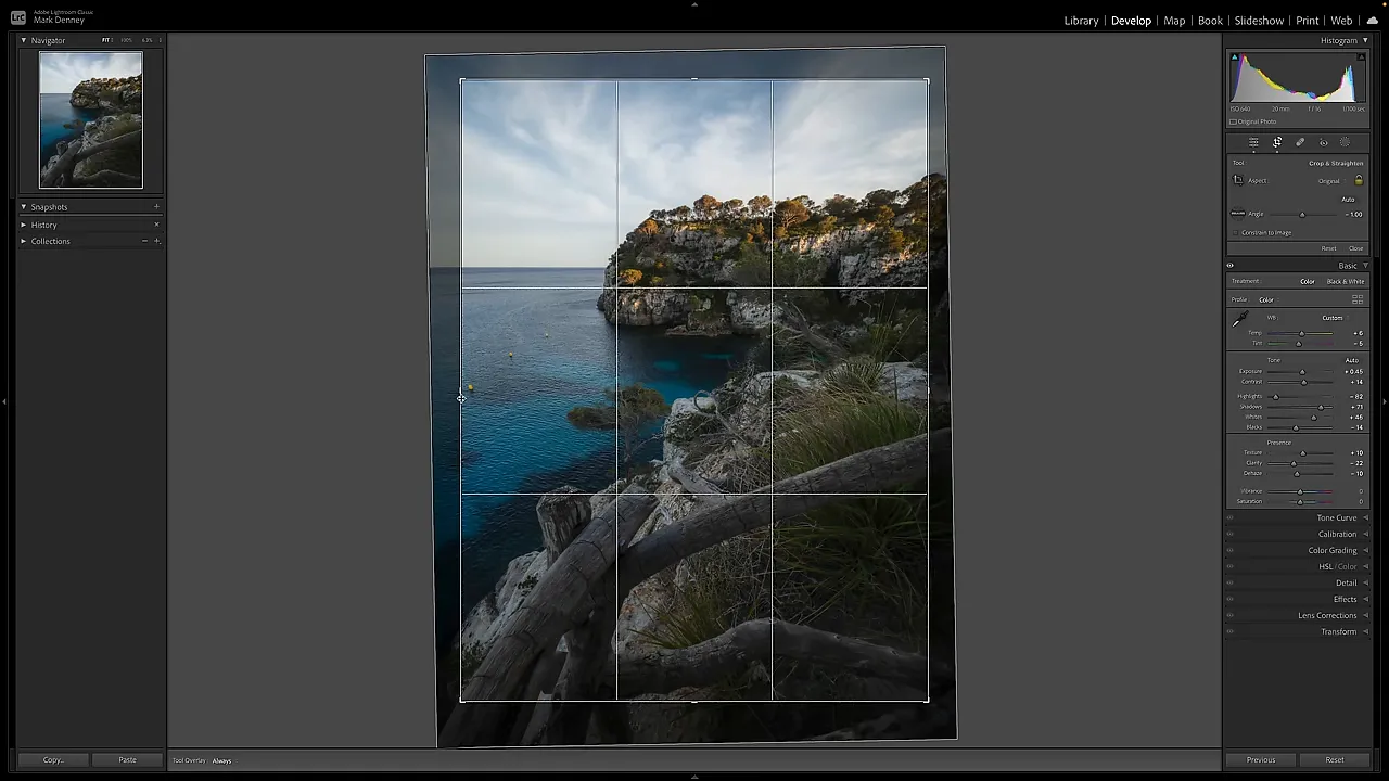
Think of this as a strong starting crop rather than an irreversible decision. Later adjustments can change how the photograph feels, and it is perfectly reasonable to revisit the framing.
5. Add Contrast With the Tone Curve
Next, I move down to the Tone Curve to refine contrast.
For this photograph, I lift the bottom endpoint slightly, darken the darker midtones, and raise the brighter midtones a little. That gives me a gentle contrast adjustment while allowing some control over the deepest tones.
I toggle the curve off and on as I work. It is easy to keep adding contrast simply because each small movement looks good in isolation. Comparing the adjustment against the previous version helps me decide whether it is actually improving the image.
The exact shape is personal preference. I’m looking for enough separation to give the scene depth, without undoing all the foreground detail I just recovered.
6. Refine Color From Broad Adjustments to Specific Ones
I keep Calibration, Color Grading, and HSL together because they let me move through color decisions in a logical sequence.
Calibration: establish the overall color feel
Calibration is one of my favorite ways to edit color. In this example, I increase Blue Primary saturation, add some Green Primary saturation with a small hue adjustment, and increase Red Primary saturation as well.
I make these changes by looking at the entire photograph, then toggle the panel off and on to see the combined effect. The goal is a color treatment that supports the scene, not a particular set of numbers.
If Calibration feels confusing, I created a free Lightroom Colors course that explains how the panel works and how it differs from HSL.
|
Color Grading: add subtle warmth and coolness
I do not use Color Grading on every photograph. For this coastal scene, though, a little warmth in the highlights helps emphasize the late-day light, while a subtle cooler tint in the shadows adds a complementary feel.
The key word is subtle. Toggling the adjustment should reveal a useful refinement, not an entirely different scene.
HSL: simplify the color palette
After the broader color adjustments, I use HSL to address individual colors:
- Reduce orange saturation slightly.
- Increase green luminance to brighten the grass.
- Shift the green hue so the vegetation blends more comfortably with the surrounding colors.
Too many competing colors can become distracting. Sometimes improving color is less about making everything stronger and more about helping the palette feel simpler and more cohesive.
7. Sharpen, Add a Subtle Vignette, and Check Corrections
Next is the Detail panel. I increase sharpening, bring the Detail setting to around 75, and try a Radius of about 2 for this image.
Those are example settings, not a universal sharpening recipe. I zoom into the fence and compare the effect off and on to see whether the texture looks better at a closer scale.
After sharpening, I move to Effects and add a subtle dark vignette. I want a little help keeping attention inside the photograph, without making the corners look obviously treated.
Lens Corrections and Transform are next in my panel order, but I skip them for this particular edit. Keeping a panel in the workflow does not mean I have to use it. It simply gives me a consistent place to consider whether it is needed.
8. Use Local Masks to Guide Attention
Only after the overall exposure and color are in place do I start making local adjustments.
At this stage, I’m asking a different question: Which specific areas need more attention? For this photograph, I use three masks, each with a clear purpose.
Enhance the existing sunlight with a radial gradient
The sun was about to set, and light was coming through the upper-right portion of the scene. I place a wide, angled radial gradient across that area to enhance the light that was already there.
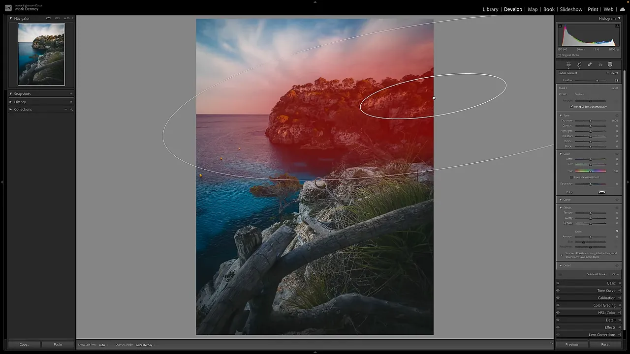
Within that mask, I lower Highlights slightly, reduce Clarity, add a little negative Dehaze, and warm the color gently. I’m looking for a softer, warmer quality of light, not a heavy orange glow.
Lift the dark foreground with a linear gradient
The lower-right corner still feels too dark, so I draw a linear gradient across the foreground. A small increase in Shadows and Exposure brings back more detail in that area.
This is why I save masking until after the global adjustments. I can brighten the corner that needs help without continuing to raise the brightness of the entire photograph.
Bring out the fence texture with a brush
The fence deserves a little extra attention because it is such an important part of the composition. I create a Brush mask and paint additional Clarity and Texture onto the wood.
Initially, I turn Clarity up much higher than I intend to leave it. That makes the effect easier to see while painting. Once the mask is in place, I bring Clarity back down to a more realistic level and refine Texture.
Two shortcuts make this easier:
- Bracket keys: Adjust the brush size.
- O: Toggle the mask overlay to check the painted area.
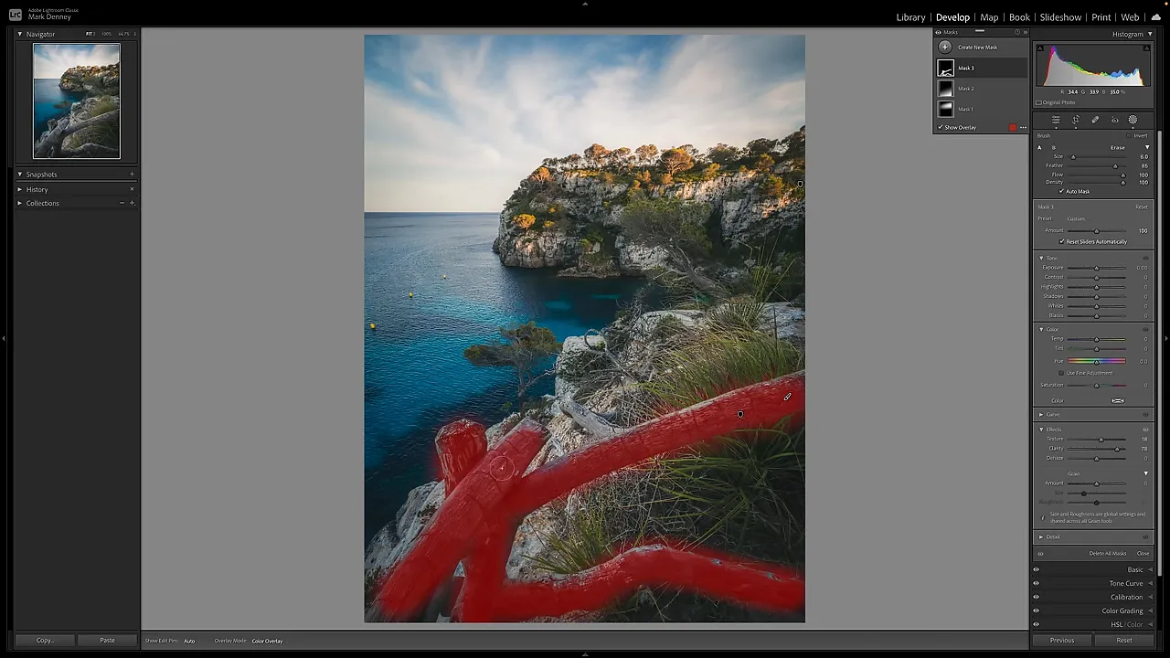
I inspect the fence close up, then return to the full composition and toggle all the masks off and on. Individual adjustments should work together to improve the photograph as a whole.
9. Revisit the Basics and Clean Up Distractions
After masking, I sometimes return to the Basic panel for a small final adjustment. Here, I increase the overall brightness a touch and pull the highlights down a little more.
A consistent workflow does not mean you can never go backward. It gives you a reliable first pass, followed by an opportunity to refine the result.
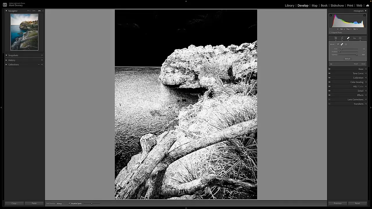
My final task is cleanup. I look for sensor spots, unusual bright pixels, objects sticking into the frame, and anything else that distracts from the photograph.
In this image, I keep the yellow buoys. They complement the warm yellow tones elsewhere and help balance the left side of the composition. I do, however, shift the crop slightly to give them more room away from the edge.
I also find a few bright pixel defects on the fence. Using the healing tool with Content-Aware Remove selected, I click those small distractions away.
If spots are difficult to locate, turn on Visualize Spots. Its high-contrast display can make sensor dust and other small issues easier to identify.
A Consistent Process, Not Identical Settings
The most useful part of this photo editing workflow is not any individual slider value. It is the order of decisions: balance the light, establish white balance and composition, refine contrast and color, address detail, make local adjustments, and clean up the finished image.
Organizing Lightroom around that sequence makes the process easier to remember. You spend less time wondering where to start or what you forgot, and more time deciding what the photograph actually needs.
You do not have to use every tool. You just need a dependable way to consider the important ones.
Sponsor Note
Thanks to Squarespace for sponsoring this tutorial. I use it for my website and e-commerce needs, including photography portfolios, customizable galleries, and selling physical, digital, and service products. Its Asset Library also lets me organize and access content in one place. The sponsor offer includes a free trial and 10% off your first website or domain purchase.


